.svg)


.svg)
- Eight KPIs are enough; more than that dilutes focus and kills accountability
- Split them into Tier 1 (executive-visible) and Tier 2 (operational) for cleaner reporting
- Every KPI needs a formula, a benchmark, and a cadence, or it's just a number
- Run a 90-day baseline before setting targets; industry averages aren't your averages
- Review operational KPIs weekly, strategic ones quarterly
The eight workplace KPIs every team should track are: cost per occupied desk, peak utilization rate, attendance adherence vs. policy, workplace eNPS, meeting room no-show rate, space allocation ratio, vendor SLA adherence, and incident response time. These eight give your CEO the "one slide" view of whether the workplace function is delivering value, and give your ops team the levers to actually improve it. Everything else is noise until these are dialed in.
Why most teams track too many workplace KPIs
Here's a pattern I see constantly. A new Head of Workplace inherits a dashboard with 25 metrics, half of which nobody's looked at in months. The data exists, but it doesn't drive decisions.
High-performing organizations carry 9 to 11 measures on their executive dashboards. Not 25. Not 40. When you track everything, you're really tracking nothing, because no single metric gets enough attention to trigger action when it moves in the wrong direction.
The fix is a tiered model. Tier 1 KPIs go on the CEO's slide. They answer: "Is our workplace spending justified, and are people actually using it?" Tier 2 KPIs stay with the ops team. They answer: "Where are the operational bottlenecks, and are we fixing them fast enough?" If you haven't built a workplace strategy that defines what "good" looks like for your company, start there. KPIs without strategy are just spreadsheets.
Tier 1: The four workplace KPIs your CEO should see
These are the metrics that connect workplace operations to business outcomes. They belong on the quarterly board deck.
1. Cost per occupied desk
This is the single most important financial metric for a workplace function. Not cost per desk. Cost per occupied desk. The difference matters enormously.
Formula:
Total Annual Workplace Spend ÷ (Total Desks × Average Occupancy Rate) = Cost Per Occupied Desk
If you're spending $15,000 per desk annually and your occupancy rate is 50%, your cost per occupied desk is $30,000. That number gets a CFO's attention fast.
Benchmark: Varies wildly by market, but the goal is to track the trend line, not hit a universal number. Our cost per desk deep dive walks through market-specific ranges. What matters is whether this number is going up or down quarter over quarter, and whether you can explain why.
Data source: Finance (lease + opex + capex) combined with occupancy data from badge systems or sensors.
Cadence: Monthly calculation, quarterly executive review.
2. Peak utilization rate
Average utilization is a misleading metric. A building that's 30% occupied Monday and 70% occupied Wednesday averages 50%, but you still need enough desks for Wednesday. Peak utilization tells you how much of your space is actually needed on your busiest day.
Formula:
(Highest Single-Day Occupied Desks in Period ÷ Total Available Desks) × 100 = Peak Utilization Rate (%)
Benchmark: Global office utilization hit 53% on average in recent CBRE data, with peak utilization reaching 80%. If your peak is consistently below 65%, you're likely over-provisioned. If it's above 90%, you're running too tight and people can't find desks on busy days.
Data source: Badge swipes, WiFi connections, or sensor data. For a full breakdown of how to collect and interpret this, see our guide on office occupancy rate.
Cadence: Weekly tracking, monthly trend review, quarterly strategic decision (expand, contract, or hold).
3. Attendance adherence vs. policy
If your company has a three-day-in-office policy, this KPI tells you whether people are actually showing up three days. It's the gap between policy and reality.
Formula:
(Employees Meeting Attendance Policy ÷ Total Employees Subject to Policy) × 100 = Attendance Adherence Rate (%)
Benchmark: A good attendance rate exceeds 90%. In practice, most hybrid companies I talk to are somewhere between 60% and 85% adherence. Below 70% means your policy is either unenforceable or unpopular enough that people are ignoring it.
Data source: Badge data cross-referenced with HR policy records. This is where workplace data integration becomes critical; you need badge, HRIS, and policy data in one place.
Cadence: Weekly for ops visibility, monthly for manager-level reporting, quarterly for executive review.
4. Workplace experience score (eNPS)
Numbers tell you what's happening. eNPS tells you how people feel about it. A building can be 80% used and still hated if the conference rooms are always booked, the HVAC is broken, and the coffee is terrible.
Formula:
% Promoters (9-10 rating) − % Detractors (0-6 rating) = Workplace eNPS
Benchmark: A score above 0 is considered good; 10 to 30 is healthy, and 50+ is exceptional. The key is tracking movement over time, not obsessing over the absolute number. A jump from 5 to 20 after a renovation tells you the investment worked.
Data source: Quarterly pulse surveys (keep them short; five questions max). For survey design that actually gets honest responses, check out our workplace satisfaction survey guide.
Cadence: Quarterly survey, with results presented alongside the financial KPIs so leadership sees the full picture.

Your CEO doesn't want raw data. This guide shows you how to turn occupancy numbers into a narrative that drives decisions.
Read the guide
Tier 2: The four operational KPIs your team needs daily
These metrics don't belong on the CEO's slide. They belong on your team's weekly standup agenda. They're the early-warning system that keeps Tier 1 numbers healthy.
5. Meeting room no-show rate
Ghost bookings are one of the most frustrating problems in hybrid offices. Someone books a room, never shows up, and three other teams can't find space. It's a solvable problem, but only if you're measuring it.
Formula:
(Booked Rooms Not Used ÷ Total Room Bookings) × 100 = No-Show Rate (%)
Benchmark: The industry-standard no-show rate is 18 to 25%, but best-in-class organizations get below 10% using auto-release policies and check-in requirements. If you're above 25%, you don't have a space shortage; you have a booking hygiene problem.
Data source: Room booking system logs, ideally with check-in confirmation. Tools like AI room scheduling can auto-release rooms that aren't checked into within 10 to 15 minutes.
Cadence: Weekly. This is a fast-feedback metric. If no-shows spike after a policy change, you'll know within days.
6. Space allocation ratio
This measures how many employees share each physical workspace. A 1:1 ratio means every employee has a dedicated desk. A 3:1 ratio means three employees share one desk. In a hybrid world, 1:1 is almost always wasteful.
Formula:
Total Employees Assigned to Location ÷ Total Workstations = Space Allocation Ratio
Benchmark: 83% of organizations now use job function data to inform sharing ratios, rather than applying a blanket number. A team that's in-office four days a week needs a different ratio than a team that comes in once. Most hybrid companies land between 1.5:1 and 2.5:1 overall.
Data source: HRIS headcount data + facilities desk count. For a deeper look at how to measure and optimize this, see our space utilization metrics guide.
Cadence: Monthly review, with quarterly adjustments tied to headcount changes.
7. Vendor SLA adherence
Your workplace runs on vendors: cleaning, catering, maintenance, security, IT support. If they're missing SLAs, your employees feel it before your dashboard shows it.
Formula:
(Vendor Tasks Completed Within SLA ÷ Total Vendor Tasks) × 100 = SLA Adherence Rate (%)
Benchmark: Target 95%+ for critical vendors (cleaning, HVAC, security). Below 90% on any critical vendor warrants a contract review. For non-critical vendors, 85%+ is acceptable.
Data source: Facilities management ticketing system or vendor reporting portal. If you're still tracking this in email threads, our vendor onboarding guide covers how to set up proper SLA tracking from day one.
Cadence: Weekly review of open tickets, monthly SLA scorecard per vendor.
8. Incident response time
How fast does your team respond when something breaks? A jammed badge reader at 8:30 AM, a burst pipe in the server room, a broken elevator on a peak day. This KPI measures operational readiness.
Formula:
Time of Resolution − Time of Report = Incident Response Time (hours)
Benchmark: Critical incidents (safety, access, HVAC failure): under 2 hours. Standard incidents (broken furniture, minor IT issues): under 24 hours. Track the median, not the average; one outlier shouldn't mask consistent performance.
Data source: Facilities ticketing system with timestamp tracking.
Cadence: Weekly review of open and resolved tickets, monthly trend analysis.
Gable's workplace analytics platform aggregates badge, booking, and survey data into a single dashboard, so your KPIs update automatically instead of living in spreadsheets.
Learn more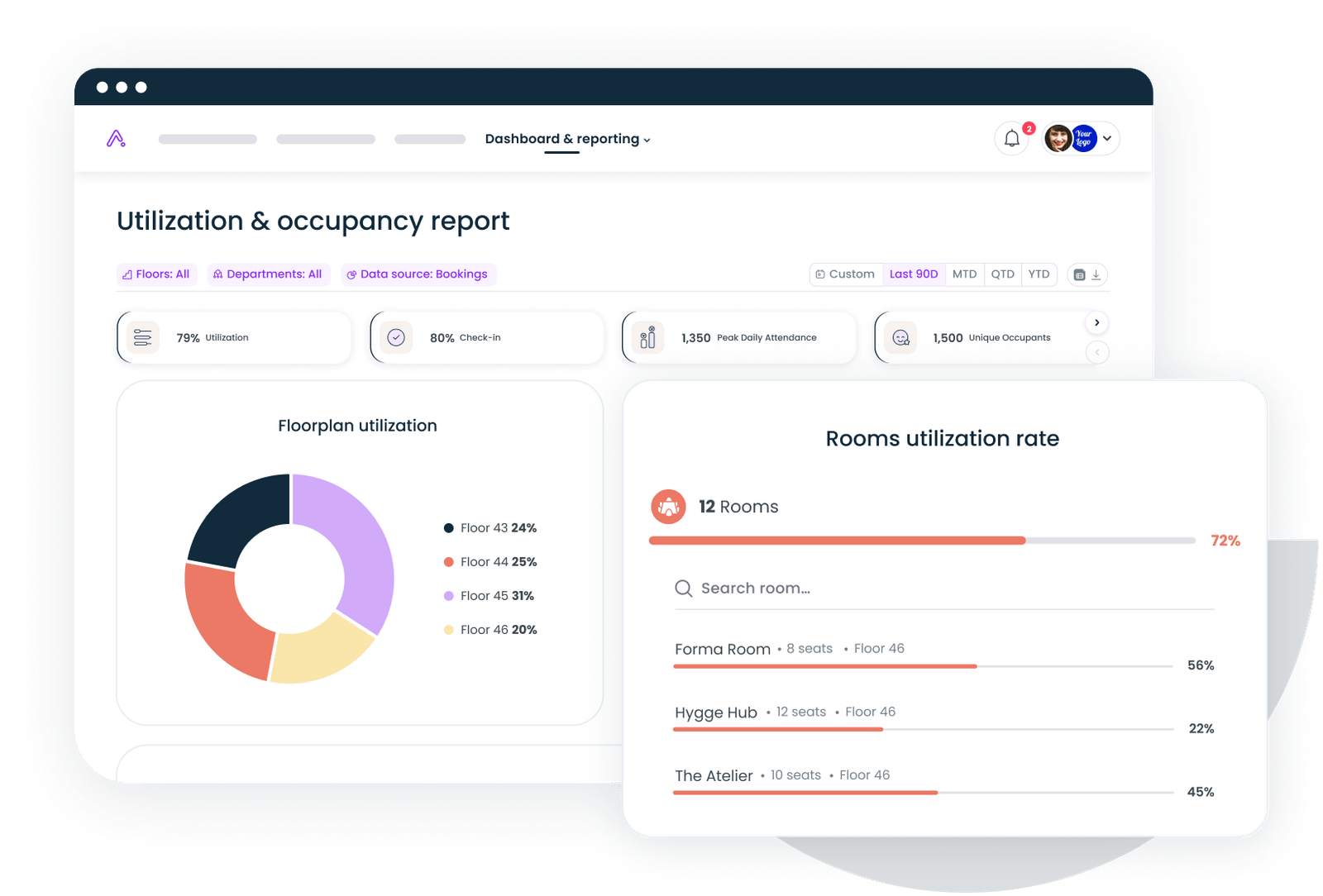
How to set initial targets: The 90-day baseline approach
Don't set targets on day one. I've watched teams pick a number out of a benchmark report, miss it for three straight quarters, and then stop reporting the metric entirely. That's worse than having no target at all.
Here's what works instead.
Weeks 1 to 2: Define your eight KPIs and data sources. Confirm you can actually collect the data. If you can't measure meeting room no-shows because your booking system doesn't have check-in, that's a technology gap to close before you set a target.
Weeks 3 to 12: Collect baseline data. Ninety days gives you enough data to account for seasonal variation, holiday weeks, and the natural rhythm of your office. Thirty days isn't enough; you'll mistake one bad month for a trend.
Week 13: Set targets. Use your 90-day baseline as the starting point, then adjust based on industry benchmarks. If your peak utilization baseline is 45% and the industry benchmark is 65%+, don't set a target of 65% for next quarter. Set it at 52% (a 15% improvement) and build from there.
Ongoing: Revisit targets quarterly. A target you hit every single quarter isn't ambitious enough. A target you miss every single quarter is demoralizing. The sweet spot is hitting roughly 70 to 80% of your targets each cycle.
Platforms like Gable can compress the baseline phase significantly by pulling badge, booking, and HRIS data into one view automatically, so you're not spending six weeks wrangling spreadsheets before you even start measuring. For a broader look at how workplace analytics connects to decision-making, that's the product category to explore.
KPI Cadence: when to review what
Not every metric deserves the same attention cycle. Here's how to structure your reviews without drowning in dashboards.
The weekly metrics are your operational pulse. If something's off, you catch it in days, not months. The quarterly metrics are your strategic compass. They tell you whether the workplace is heading in the right direction.
For teams managing multiple locations, this cadence gets more complex. Our guide on managing multiple office locations covers how to roll up site-level KPIs into a portfolio view without losing the signal.
Common mistakes that tank workplace KPI programs
I've seen the same five mistakes kill KPI programs at companies of every size.
Mistake 1: Tracking too many metrics. If your dashboard has 30 KPIs, nobody's accountable for any of them. Pick eight. If you absolutely must track more, keep the extras in an operational appendix that nobody presents to leadership.
Mistake 2: No targets. A KPI without a target is just a number. "Our utilization is 48%" means nothing until you've decided whether 48% is good, bad, or expected. Set targets after your 90-day baseline, and write them down where everyone can see them.
Mistake 3: No action on misses. This is the most common failure. The team reviews KPIs monthly, notes that no-show rates are at 30%, and then... nothing happens. Every KPI needs a pre-defined action trigger. "If no-show rate exceeds 25% for two consecutive weeks, we implement 15-minute auto-release." Write the trigger when you set the target, not after you've missed it three times.
Mistake 4: Confusing activity with outcomes. "Number of desk bookings" is an activity metric. "Cost per occupied desk" is an outcome metric. Activity metrics are useful for debugging, but they don't belong on the executive slide. Your workplace ROI metrics should always tie back to business outcomes: cost, productivity, or experience.
Mistake 5: Treating KPIs as static. Your workplace changes. Headcount grows, policies shift, leases expire. Review your KPI framework annually. An indicator that mattered when you had two offices might be irrelevant when you have eight.
Making your workplace KPIs stick
The difference between companies that use KPIs well and companies that just have them comes down to three things: a small number of metrics, clear ownership, and pre-committed actions when numbers move.
Start with these eight. Run a 90-day baseline. Set realistic targets. Build a cadence that matches the speed of each metric. And most importantly, decide in advance what you'll do when a KPI misses its target. The dashboard isn't the hard part. The discipline to act on it is.
From badge data to booking analytics to experience surveys, Gable brings your workplace metrics into one platform so you can stop exporting CSVs and start making decisions.
Get a demo