.svg)


.svg)
- Every utilization report needs five sections: executive summary, headline metrics, zone breakdown, trends, and recommendations
- Lead with three numbers and one recommendation; your CFO won't read past page two
- Annotate quarter-over-quarter trends with known events like RTO mandates or hiring waves
- Multi-source data (bookings, badges, sensors) beats any single collection method
- Below-50% utilization doesn't automatically mean "downsize"; it means you have options
An office utilization report is the document that translates raw space data into decisions your leadership team can act on. It answers one question: are we getting enough value from the real estate we're paying for? Every report worth presenting needs five sections: an executive summary, headline metrics, a zone-by-zone breakdown, quarter-over-quarter trends, and clear recommendations. This guide walks through each section so you can build yours from scratch.
Why your board is asking for an office utilization report
The short answer: hybrid work made office costs visible in a way they weren't before. When everyone came in five days a week, utilization was a facilities concern. Now it's a finance concern.
Global utilization hit 53% in 2026, up from 35% in 2023. That sounds like progress until you realize most companies are targeting 79% utilization, leaving a 25-point gap between where they are and where they need to be. That gap represents millions in wasted lease costs, underused amenities, and maintenance spend on floors nobody visits.
Your board sees the gap. They want to know how big it is, what's causing it, and what you're going to do about it. That's what the report is for.
If you're still getting comfortable with the difference between occupancy and utilization, our guide on office occupancy rate fundamentals is a good starting point. They're related but not interchangeable, and mixing them up in a board presentation will cost you credibility fast.
Section 1: Executive summary, three numbers and one recommendation
This is the only page some board members will read. Make it count.
Your executive summary should fit on a single slide or half a page. It contains three numbers and one recommendation. That's it. No methodology, no caveats, no "we're still collecting data." Those belong later.
The three numbers:
- Current average utilization rate. This is your headline. "Our offices averaged 41% utilization in Q1 2026." Simple, unambiguous.
- Peak utilization. The highest single-day or single-week number. This tells the capacity story. "Peak utilization hit 68% on Tuesdays, meaning we're near capacity on our busiest day."
- Cost per occupied seat. Take your total real estate cost and divide by the number of seats actually used on an average day. If you're paying $18,000 per seat annually but only 40% are occupied, your effective cost is $45,000 per occupied seat. That number gets attention.
The one recommendation:
Pick the single most important action. Not three options. Not a menu. One thing. "We recommend consolidating floors 3 and 4 to reduce annual lease costs by $1.2M." Or: "We recommend piloting anchor days on Tuesday and Thursday to increase midweek utilization from 41% to 60%."
For a deeper look at how to frame cost-per-seat and other financial metrics, our breakdown of workplace ROI metrics walks through the formulas.
Section 2: Headline metrics that tell the usage story
This section is where you show the board how the office is actually being used, not how you hoped it would be used.
Average utilization rate is the foundation. Calculate it as: (occupied seats ÷ total available seats) × 100, averaged across all workdays in the reporting period. If you need a refresher on the formulas and what "good" looks like, our space utilization metrics guide covers the math in detail.
Peak utilization reveals your capacity ceiling. Most hybrid offices see Tuesday through Thursday as their busiest window. If your peak is already above 80%, people are struggling to find desks and meeting rooms on those days. That's a different problem than underutilization, and it requires a different solution.
Day-of-week patterns are where the story gets interesting. The typical hybrid office sees midweek peaks and sharp Friday drops. Present this as a simple bar chart: Monday through Friday, utilization percentage for each day. Leadership will immediately see the shape of the week.
Meeting room no-show rates deserve their own line item. Up to 40% of booked rooms go unoccupied, meaning rooms are reserved but nobody shows up. This inflates your "booked" numbers and hides real capacity. If you're not tracking check-ins against bookings, your utilization data is probably 15 to 25 percentage points more optimistic than reality.
Ghost bookings are the silent budget killer. Someone books a desk for the week, comes in twice, and the system shows 100% utilization for that seat. Without check-in verification, you can't distinguish between declared intent and actual presence. Flag this gap explicitly in your report. It builds the case for better data collection (more on that in section 7).

Our space utilization guide covers every metric in this section, including the formulas your team needs and the benchmarks to compare against.
Read the guide
Section 3: Floor-by-floor and zone-by-zone breakdown
Averages hide problems. A building-wide utilization rate of 45% might mean floor 1 is at 72% and floor 4 is at 18%. Those two floors need completely different interventions.
Structure this section as a simple table:
Now the conversation shifts from "is our office underutilized?" to "which specific zones need attention?" Floor 1 might need more seats. Floor 4 might need to be subleased or reconfigured.
Break it down further by space type. Collaboration zones, focus areas, meeting rooms, and individual desks all tell different stories. If your meeting rooms are at 85% but your open desks are at 30%, you don't have a utilization problem; you have a space mix problem. Teams want to collaborate, and you've given them rows of empty desks instead.
This is also where you surface amenity-driven patterns. Rooms with video conferencing equipment tend to run at higher utilization than rooms without it. Floors near the café or lobby often outperform upper floors. These details help facilities teams make targeted investments instead of blanket changes.
For teams considering a full reconfiguration based on zone data, our office reorganization playbook covers the operational steps.
Section 4: Trends, quarter-over-quarter with annotations
A single quarter's data is a snapshot. Two or more quarters become a story. This section is where you show direction.
Present a simple line chart: utilization rate on the Y-axis, weeks or months on the X-axis, with at least two quarters of data. Then annotate it. Every spike and dip should have a label explaining what happened.
Common annotations include:
- RTO mandate enforcement (e.g., "Week of March 3: company-wide return-to-office policy took effect; utilization jumped from 38% to 52%")
- New hire wave (e.g., "Q1 onboarding cohort of 45 employees; floor 2 utilization increased 8 points")
- Holiday season (e.g., "Weeks 51-52: utilization dropped to 12% due to company shutdown")
- Office reconfiguration (e.g., "Floor 3 converted from assigned desks to hot desking; utilization increased from 34% to 47%")
- Seasonal patterns (e.g., "Summer Fridays policy reduced Friday utilization by 15 points")
Without annotations, leadership will ask "why did it drop here?" and you'll scramble for context. With annotations, you control the narrative.
The trend line matters more than any single data point. If utilization is climbing 2 to 3 points per quarter, you're heading toward a capacity conversation. If it's flat or declining despite an RTO mandate, the mandate isn't working, and you need a different approach. Our guide on measuring hybrid work success covers how to evaluate whether policy changes are actually moving the needle.
Section 5: Recommendations, what to do with the data
This is the section your CFO and CHRO will debate. Make it concrete.
Frame your recommendations around three scenarios based on what the data shows:
Scenario A: Average utilization below 50%. You're paying for space nobody's using. Options include consolidating floors, subleasing unused space, or converting to flex arrangements. If your lease is coming up, this is the moment to reduce real estate costs by right-sizing. Quantify the savings: "Consolidating floors 3 and 4 would save $1.4M annually in lease and operating costs."
Scenario B: Average utilization between 50% and 70%. You're in the optimization window. The space isn't dramatically oversized, but it's not configured for how people actually work. Recommendations here tend to focus on reconfiguration (more collaboration space, fewer individual desks), policy adjustments (designated team days, anchor days), or amenity investments that pull people in on low-traffic days.
Scenario C: Peak utilization above 80%. You have a capacity problem on your busiest days. People can't find desks or rooms, which creates friction and drives them back home. Solutions include staggering in-office days across teams, implementing hot desking to increase density, or expanding into additional space. The board needs to hear: "On Tuesdays and Wednesdays, we're turning people away. That costs us in collaboration and culture."
Each recommendation should include a cost estimate, a timeline, and the expected impact on utilization. "If we implement anchor days, we project midweek utilization will increase from 52% to 65% within two quarters, while Monday and Friday utilization may decrease by 5 points. Net effect: more predictable space demand and better collaboration density."
Gable Offices captures desk and room booking data alongside check-in verification, giving you the real utilization numbers your report needs, without manual data pulls.
Learn more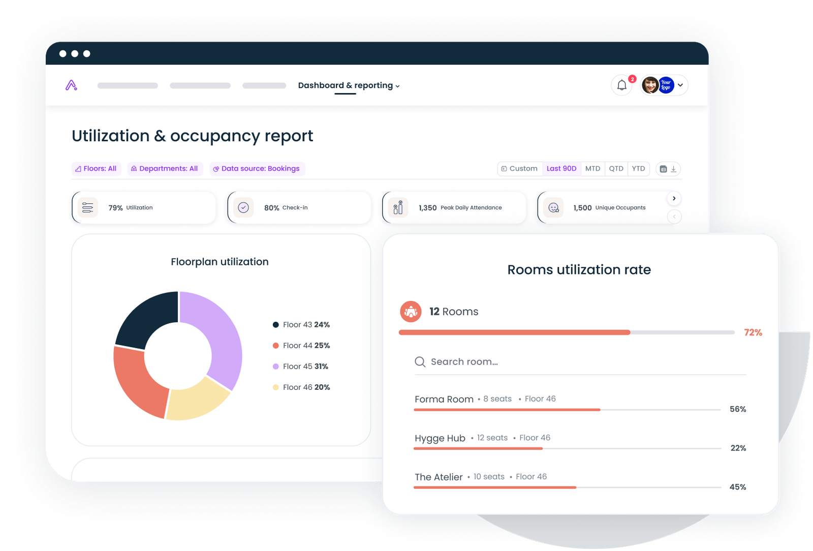
How to collect the underlying data
Your report is only as good as your data sources. Most organizations rely on one; the best ones triangulate across several.
Desk and room booking software captures declared intent. When someone reserves a desk for Wednesday, that's a data point. The weakness: it doesn't confirm they actually showed up. Booking data alone can overstate utilization by 15 to 25 percentage points. That said, booking platforms that include check-in verification (QR codes, badge taps, or automatic release of no-show reservations) close much of that gap. Workplace analytics platforms that unify booking and check-in data in one dashboard make this significantly easier to report on.
Badge and Wi-Fi data captures actual presence. If someone badged into the building, they were there. Wi-Fi connection logs offer a similar signal. The strength is ground truth. The weakness: badge data tells you someone entered the building, not that they used a specific desk or floor. And privacy considerations matter; our guide on workplace sensors and privacy covers how to collect occupancy data without crossing ethical lines.
Occupancy sensors (under-desk, ceiling-mounted, or door-frame counters) provide the most granular data. They tell you exactly which seats and rooms were occupied, for how long, and at what times. Average utilization reached 43% across sensor-equipped offices in mid-2026, with July and September hitting the highest post-pandemic levels recorded. Sensors are the gold standard for accuracy, but they're also the most expensive to deploy and maintain.
Employee surveys capture something no sensor can: satisfaction and intent. "Do you feel you can find a desk when you need one?" and "What would make you come in more often?" add qualitative context to quantitative data. They're especially useful for the recommendations section, where you need to explain not just what's happening but why.
The best approach combines at least two sources. Booking data plus badge data gives you both intent and presence. Add a quarterly survey and you have the full picture. If you're building your first report, start with whatever data you already have. Don't let perfect data collection delay the first report by six months.
Building your report template
You don't need to start from a blank page. Here's a structure you can copy directly into a slide deck or document.
Slide 1: Executive summary
- Headline utilization rate (one number, large font)
- Peak utilization and cost per occupied seat (two supporting numbers)
- One recommendation (one sentence, bolded)
Slide 2: Day-of-week utilization
- Bar chart: Monday through Friday
- Callout box with the highest and lowest days
Slide 3: Zone breakdown
- Table with floor/zone, average utilization, peak utilization, seats available, seats used
- Color-code: green (above target), yellow (within 10 points), red (below target by 10+ points)
Slide 4: Quarter-over-quarter trend
- Line chart with annotations for known events
- Arrow indicating direction (up, flat, or down)
Slide 5: Meeting room utilization
- Booking rate vs. actual occupancy (highlight the ghost booking gap)
- Top 5 most-used and least-used rooms
Slide 6: Recommendations
- One primary recommendation with cost estimate and timeline
- One or two secondary options if the primary isn't approved
- Expected impact on utilization rate
Slide 7: Data sources and methodology
- Which data sources were used
- Reporting period
- Any known gaps or limitations (be transparent; it builds trust)
This structure works whether you're presenting to a five-person leadership team or a 15-person board. The key is keeping each slide to one idea. If a slide needs a paragraph of explanation, it's too complex.
For teams using workplace analytics tools, most of these slides can be auto-generated from dashboard exports rather than built manually each quarter.
The report is the starting point, not the finish line
Building your first office utilization report is the hard part. The second one is easier because you have a baseline to compare against. The third one is where patterns emerge and recommendations start to feel obvious.
The real value isn't in any single report. It's in the rhythm of reporting: collecting data, presenting it clearly, making a recommendation, measuring the impact, and adjusting. Over time, your leadership team stops asking "how used is our office?" and starts asking "what should we do differently this quarter?" That's the shift from reactive facilities management to strategic workplace planning.
Don't wait for perfect data. Don't wait for sensors on every desk. Use what you have, be transparent about the gaps, and deliver a report that answers the three questions every board member has: how much are we spending, how much are we using, and what should we change?
Gable gives you the booking, check-in, and analytics data you need to build the report outlined above, without stitching together spreadsheets from five different tools.
Get a demo