.svg)


.svg)
- Every workplace dashboard needs four views: occupancy, cost, experience, and operations
- Most dashboards fail because they show data nobody asked for
- Connect booking, badge, survey, and finance systems or you're guessing
- Build vs. buy depends on your team size and data maturity
- Start with 5 metrics, not 50
Most workplace teams have data. What they don't have is a dashboard anyone actually opens.
We've seen this pattern dozens of times. Someone gets asked to "put together a dashboard" for a quarterly business review. They spend three weeks pulling numbers from six systems, drop everything into a BI tool, and produce 14 charts that nobody reads past slide two. The problem isn't the data. It's the design.
A good workplace dashboard has four sections: occupancy, cost, experience, and operations. That's it. If your dashboard doesn't map cleanly to those four, you're either missing something important or showing something nobody needs.
This guide walks through what belongs in each section, where the data comes from, and whether you should build it yourself or buy a platform that does it for you.
Why most workplace dashboards fail
The most common failure mode isn't missing data. It's too much of it.
Workplace leaders pull every metric they can find, dump it into Looker or Tableau, and call it a dashboard. The result is a wall of charts that answers questions nobody asked. Your CFO doesn't care about average meeting duration. Your CHRO doesn't need a floor-by-floor sensor heatmap.
A dashboard that tries to serve everyone serves no one. The fix is simple: design each view for a specific audience with a specific question.
72% of workplace data goes in most organizations, not because it's unavailable but because it's presented without context. That stat should bother you. It means most of the infrastructure you've built to collect workplace data is generating noise, not signal.
The dashboards that actually get used share three traits. They answer a question in under 10 seconds. They update automatically. And they connect to decisions that have budget implications.
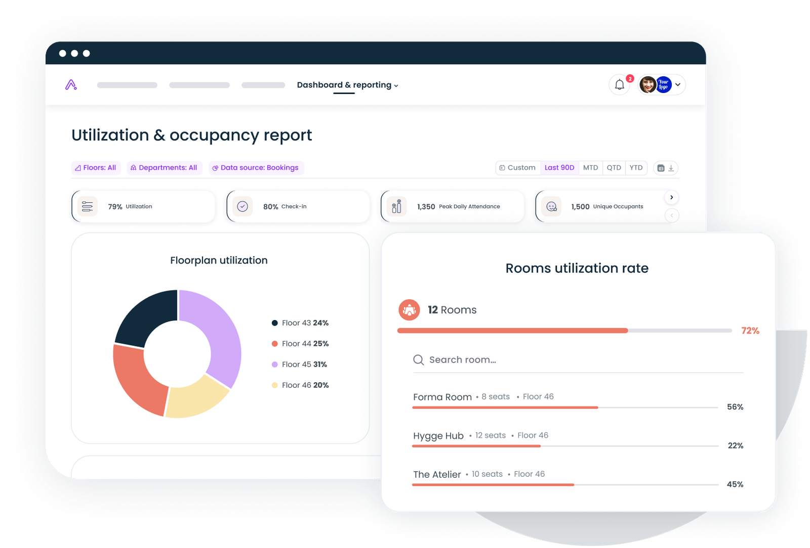
Section 1: The occupancy view
This is the section your real estate team and CFO will look at first. It answers one question: are we using the space we're paying for?
What to include
Utilization rate is the headline metric. Not how many desks exist, but how many get used on a given day as a percentage of capacity. If you're running a hybrid office, anything below 40% on your slowest day is a signal worth investigating. Anything above 80% on your busiest day means people are competing for space.
Peak day and time analysis shows when your office actually fills up. Most hybrid companies see Tuesday through Thursday spikes, with Monday and Friday running 30-50% lower than midweek peaks. Knowing this lets you right-size cleaning, catering, and HVAC schedules.
Floor-by-floor or zone breakdown matters once you're above 20,000 square feet. One floor at 90% while another sits at 25% isn't a utilization problem. It's a space allocation problem.
Where the data comes from
Badge swipes give you entry counts. Booking systems give you intent. Occupancy sensors give you actual presence. The best occupancy views combine all three, because each source has blind spots. Badge data misses tailgaters. Booking data misses no-shows. Sensors miss context.
If you're just starting out, badge plus booking data gets you 80% of the picture. Sensors are worth the investment once you're optimizing at the zone level. For a deeper look at what to track and how, our space utilization metrics guide breaks down the math.

Cost per occupied desk, allocation rates, peak utilization — the math behind every occupancy chart.
Read the guide
Section 2: The cost view
Space costs money whether people show up or not. The cost view makes that visible.
What to include
Cost per occupied desk is the metric that changes conversations. Take your total occupancy cost (rent, utilities, maintenance, services) and divide by the average number of desks actually used per day. Most companies are shocked when they see this number. A desk that costs $800/month on paper costs $2,000/month when it's only used twice a week.
Total occupancy cost trend shows whether your spending is going up, down, or flat over time, and whether that tracks with headcount changes. If headcount dropped 10% but occupancy costs stayed flat, you've got a portfolio problem.
Vendor spend breakdown covers everything from cleaning to catering to coworking passes. This is where hidden costs live. One company I worked with discovered they were spending $14,000/month on catering for a floor that averaged 12 people on Fridays.
Where the data comes from
Your finance system (NetSuite, SAP, whatever you use) provides the cost side. Your booking and badge systems provide the denominator. The trick is connecting them, which is why workplace data integration matters so much. Without it, you're manually pulling CSVs every quarter and hoping the numbers line up.
For benchmarking, compare your cost per desk against industry averages by city. If you're paying $1,200 per occupied desk in Austin while the benchmark is $850, that's a conversation worth having with your broker.
Section 3: The experience view
Occupancy and cost tell you what's happening with your space. Experience tells you what's happening with your people.
What to include
Workplace NPS or eNPS gives you a single number that tracks employee sentiment about the physical work environment over time. It's not perfect, but it's comparable across quarters and locations. A score below 20 means something is actively broken. Above 40 means you're doing better than most. If you're debating whether to use NPS for your office, we've written a full breakdown of workplace NPS.
No-show rate measures the gap between booked desks or rooms and actual usage. IFMA benchmarks suggest that a healthy no-show rate sits below 15%. Above 25% means your booking system is functioning as a reservation system that nobody respects, and you're making space decisions based on fiction.
Top employee feedback themes are harder to quantify but more valuable than most metrics. Pull the top three themes from your last workplace survey and display them as text, not charts. "Noise levels on Floor 3" is more actionable than a satisfaction score of 3.2.
Where the data comes from
Surveys feed the NPS and feedback data. Your booking system feeds no-show rates (compare bookings to badge or sensor check-ins). If you're running regular workplace satisfaction surveys, you already have most of what you need. The gap is usually in connecting survey responses to specific locations and time periods.
Section 4: The operations view
This section is for your workplace ops team, not the C-suite. It tracks whether the machine is running.
What to include
SLA adherence covers your service contracts. Is the cleaning crew hitting their schedule? Are IT tickets for AV issues resolved within the agreed window? Track the percentage of SLAs met per vendor per month. Anything below 90% warrants a conversation. Below 80% warrants a contract review.
Incident tracking logs safety events, facility issues, and security incidents. The number matters less than the trend. Three incidents in January and seven in March is a pattern. Display it as a simple line chart with a 90-day rolling average.
Vendor performance scores combine SLA adherence, incident response time, and cost variance into a single score per vendor. This is what you bring to vendor reviews. It turns "we feel like the cleaning has gotten worse" into "your SLA adherence dropped from 94% to 81% over the last quarter."
Where the data comes from
Your facilities management system or ticketing tool (ServiceNow, Corrigo, even a well-structured spreadsheet) feeds most of this. Badge and access control data feeds security metrics. The operations view is the one most likely to require manual input, which is fine as long as someone owns the update cadence.
Gable's office management platform connects booking, badge, and occupancy data into a single view so your ops team stops toggling between six tabs.
Explore office management
Data sources that feed each section
Here's a quick reference for what connects where:
Occupancy view: Badge/access control systems, desk and room booking platforms, occupancy sensors, Wi-Fi connection logs.
Cost view: ERP/finance systems (NetSuite, SAP, QuickBooks), lease management tools, vendor invoicing platforms, coworking pass management.
Experience view: Employee survey tools (Culture Amp, Qualtrics, Google Forms), booking system no-show data, helpdesk/feedback channels.
Operations view: CMMS/facilities ticketing (ServiceNow, Corrigo), vendor contract management, security/access logs, incident reporting tools.
The common thread is that no single system gives you the full picture. The companies that build great dashboards invest in connecting these systems before they invest in visualization. A beautiful chart built on incomplete data is still wrong.
Build vs. buy: Which approach fits your team
This is the question that stalls most dashboard projects for months. Here's how to think about it.
When to build (BI tool approach)
Build your own if you have a data team that can maintain it, your data sources are already piped into a warehouse (Snowflake, BigQuery, Redshift), and your dashboard requirements are unique enough that off-the-shelf won't cut it.
The upside: total customization. The downside: someone has to maintain it. Every time a data source changes, every time a new metric gets requested, every time a chart breaks, that's your data team's time. For companies with fewer than 500 employees, the maintenance cost usually exceeds the value within 12 months.
When to buy (workplace platform approach)
Buy if you don't have a dedicated data team, you want dashboards that update without manual intervention, and you need to be live in weeks rather than quarters.
Workplace platforms like Gable come with pre-built views that map to the four sections above. The trade-off is less customization, but for most companies, the standard views cover 90% of what leadership asks for. The workplace analytics overview covers what to look for in a platform.
The hybrid approach
Most mid-size companies (500-5,000 employees) end up somewhere in between. They use a workplace platform for the occupancy and experience views (where the platform has native data), then build custom cost and operations views in their BI tool. This works well as long as you're disciplined about not duplicating metrics across systems.
Sample dashboards by company size
Startups and small companies (under 200 Employees)
Keep it simple. One page, five metrics: daily utilization rate, cost per occupied desk, workplace NPS, no-show rate, and top three feedback themes. Update monthly. A Google Sheet with conditional formatting honestly works fine at this stage. Don't over-engineer it.
Mid-size companies (200-2,000 employees)
You need all four views, but each can fit on a single screen. Add floor-level breakdowns for occupancy, vendor spend for cost, and SLA tracking for operations. Update weekly. This is where a workplace platform starts paying for itself because manual data pulls at this scale eat 10-15 hours per month.
Enterprise (2,000+ employees)
Multiple dashboards for multiple audiences. An executive summary (one page, five metrics, updated weekly). A real estate view (occupancy and cost by location, updated daily). An ops view (SLAs, incidents, vendor scores, updated daily). An experience view (NPS trends, survey themes, updated monthly). At this scale, you need both a platform and a BI layer. The platform handles data collection and standard views. The BI tool handles cross-functional analysis and board-level reporting. Check our workplace ROI metrics guide for the specific KPIs that matter at the executive level.
Common mistakes to avoid
Starting with the tool instead of the question. Don't pick Tableau, then figure out what to show. Start with the five questions your leadership team asks most often, then work backward to the data and visualization.
Showing averages without ranges. "Average utilization is 52%" hides the fact that Tuesdays hit 85% and Fridays hit 18%. Always show the distribution, not just the mean.
Updating manually and calling it a dashboard. If someone has to pull data and paste it in every week, it's a report, not a dashboard. Dashboards update themselves. That's the whole point.
Ignoring the experience section. Cost and occupancy are easy to measure, so they get all the attention. But a dashboard that shows 60% utilization without showing that employees hate the noise levels is telling half the story.
Building for today's org chart. Your dashboard should survive a reorg. Design it around space types and cost centers, not team names that change every six months.
Book a 30-minute demo to see how Gable connects your booking, badge, and survey data into the four dashboard views covered in this guide.
Request a demo