.svg)


.svg)
- Office signage is a system, not a collection of individual signs
- ADA violations on signage can cost up to $75,000 per incident
- Digital displays capture 400% more views than static signs
- Material choice determines whether signs last 5 years or 15
- Hybrid offices need modular, updateable signage that syncs with booking systems
Office signage is the complete visual communication system that helps people navigate your space, understand your brand, and stay safe. It includes everything from the logo in your lobby to the Braille on your conference room doors. In 2026, with hybrid schedules reshaping how offices function, getting signage right means more than slapping room numbers on doors. It means building a coordinated system that works for employees who might only be on-site two days a week and visitors who've never set foot in your building.
Why office signage matters in a modern workplace
Signage is one of those things people only notice when it fails. Someone wanders the wrong hallway for five minutes looking for a meeting room. A visitor can't find the restroom. A fire exit isn't clearly marked. These aren't minor annoyances; they're signals that the workplace isn't well managed.
Seven in ten consumers judge a company based on the quality of its signage alone. That stat comes from retail, but the principle holds in offices. Candidates visiting for interviews, clients arriving for meetings, and new hires on their first day all form impressions based on what they see. A polished, coherent signage system says "we've thought this through." Mismatched signs taped to walls say the opposite.
Beyond first impressions, signage directly affects how efficiently people use space. In offices with neighborhood seating or activity-based work zones, clear identification signs are the difference between a smooth morning and ten minutes of confusion. For companies managing multiple office locations, consistent signage across sites creates a unified experience that reinforces culture regardless of which building someone walks into.
And then there's the legal side. ADA compliance isn't optional, and the penalties for getting it wrong are steep. We'll cover that in detail below.
Categories of office signage and what each does
Office signage breaks down into six functional categories. Most offices need all six, though the balance shifts depending on your space type and how people use it.
Room identification signs are the workhorses. These label conference rooms, phone booths, restrooms, storage areas, and any permanent room. They're the signs most likely to trigger ADA requirements (more on that shortly). If you've invested in creative room names, identification signs are where those names become visible.
Directional and wayfinding signage tells people where to go. Hallway arrows, floor indicators, elevator directories. These are especially critical in large or multi-floor offices where intuitive navigation isn't possible from layout alone. For a deeper look at placement strategy and sign types, our wayfinding signage guide covers the full system.
Directory signs consolidate information in one place, typically in lobbies or near elevators. They list tenants, departments, or floor layouts. In multi-tenant buildings, directories are the first thing visitors interact with after walking through the door.
Branding and logo signage establishes identity. The dimensional logo behind reception, the company values on the breakroom wall, the subtle brand colors woven into directional signs. This category is where signage overlaps with interior design.
Safety and compliance signage covers fire exits, emergency procedures, occupancy limits, wet floor warnings, and ADA-required markers. These aren't optional. They're regulated by OSHA, local fire codes, and the Americans with Disabilities Act.
Digital displays handle anything that changes. Meeting room availability, daily announcements, event schedules, visitor welcome messages. They're the most flexible category and the most expensive to implement, but they solve problems that static signs can't.
Signage materials and durability considerations
The material you choose determines how long a sign lasts, how it looks, and how much you'll spend replacing it. Here's what actually matters for each option.
Acrylic is the default for modern office interiors. It's lightweight, takes printing and engraving well, and comes in clear, frosted, or colored options. It works for room signs, directories, and branded displays. Downside: it scratches more easily than metal and can yellow with prolonged UV exposure near windows.
Aluminum and powder-coated metals are the durability champions. Marine-grade aluminum can last 15 years with minimal maintenance, while low-grade steel alternatives might rust and need replacement within five, tripling your costs over the same period. Powder coating adds color options and corrosion resistance. Best for exterior signs, parking structures, and high-traffic interior areas.
Stainless steel projects permanence and premium quality. It's common in law firms, financial services offices, and corporate headquarters where the aesthetic needs to communicate authority. It's heavier and more expensive than aluminum but virtually indestructible indoors.
Glass and etched options create a high-end, modern look. Etched or frosted glass signs work well for conference rooms and executive suites. They're fragile compared to metal or acrylic, so they're best in low-traffic, controlled environments.
Wood adds warmth. It works in creative agencies, coworking spaces, and offices going for a residential feel. Solid hardwoods last longer than veneers, but all wood signs need periodic refinishing. Not ideal for restrooms or kitchens where moisture is a factor.
Vinyl and flexible materials are the budget option for temporary or frequently changing signage. Wall decals, window graphics, floor markers. They're easy to install and remove, which makes them useful during office transitions or for seasonal messaging. They won't last more than a year or two under heavy use.
The right material depends on three things: where the sign lives (indoor vs. outdoor, high-traffic vs. low-traffic), how long it needs to last, and what aesthetic you're going for. A sustainable office design approach might also factor in recyclability and VOC emissions from manufacturing.

Directional signs are just one piece of your office signage system. Our wayfinding guide covers placement strategy, sign types, and ADA requirements for navigation systems.
Read the guide
Digital signage vs. static signage: When each makes sense
This isn't an either/or decision. It's about matching the right format to the right information type.
Static signage works best for information that doesn't change. Room names, restroom markers, exit signs, brand logos, ADA-required identification. These need to be visible 24/7 without power, internet, or software updates. They're cheaper upfront, require zero maintenance beyond occasional cleaning, and they never crash.
Digital signage works best for information that changes frequently. Meeting room availability, daily schedules, visitor welcome screens, company announcements, emergency alerts. Digital displays capture 400% more views than static alternatives, which makes them significantly more effective for time-sensitive communication.
The cost gap is real. A static acrylic room sign might run $50 to $200 installed. A digital display for the same door costs $500 to $2,000 for hardware alone, plus ongoing software subscriptions and power. But digital signs can replace dozens of static signs that would otherwise need manual updating.
The hybrid approach is what most offices land on. Static signs handle permanent identification and compliance. Digital displays handle everything dynamic. The key is making sure both systems tell the same story. If your digital directory says Conference Room B is on the third floor but the static wayfinding sign on the second floor points to the fourth, you've created confusion instead of clarity.
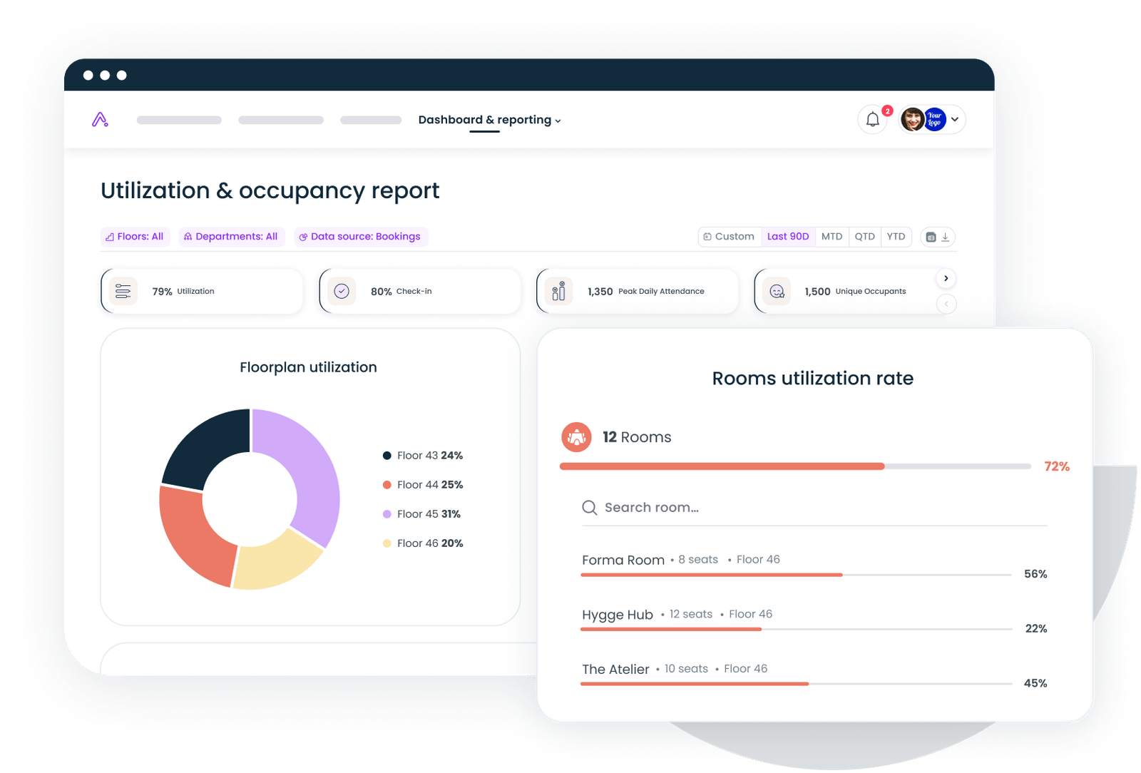
This is where the coordination layer matters. In offices with flexible seating or rooms that change purpose based on the day's bookings, signage needs to reflect reality in real time. Gable's office management software connects desk and room booking data to your floor plans, so digital displays and directories stay synchronized with how spaces are actually being used, not how they were configured six months ago.
ADA Compliance requirements you can't afford to ignore
ADA signage compliance isn't complicated, but it's unforgiving. The rules are specific, the inspections are real, and first-time violations can cost up to $75,000.
Here's what the ADA requires for permanent room identification signs (any sign that labels a room with a permanent function):
- Tactile characters. Text must be raised (not flat-printed) with a minimum 1/32-inch height from the sign surface. Characters must be sans-serif, uppercase, and between 5/8-inch and 2-inch tall.
- Grade 2 Braille. Every permanent room sign needs corresponding Braille positioned directly below the tactile text. This applies to conference rooms, restrooms, stairwells, exits, and any other permanently designated space.
- Mounting height and placement. Signs must be mounted on the latch side of the door (the side with the handle), with the baseline of the lowest tactile character between 48 and 60 inches from the floor. The sign must be positioned so a person can approach within 3 inches without any obstruction.
- Color contrast. Characters must contrast with the background. The ADA doesn't specify an exact ratio, but roughly 22% of signage violations involve insufficient contrast, particularly in executive areas where designers prioritize aesthetics over readability.
- Non-glare finish. Sign surfaces can't produce glare that makes text difficult to read.
What doesn't need ADA tactile/Braille treatment: Directional signs (arrows pointing to restrooms, for example), temporary signs, digital displays, and informational signs that don't identify a permanent room. These still need to meet general accessibility standards (readable fonts, adequate contrast), but they don't require raised text or Braille.
A common mistake: assuming that because you have digital room signs, you don't need ADA-compliant static signs. Wrong. Digital displays are supplementary. The ADA-compliant tactile sign still needs to be on the wall next to the door. Companies focused on workplace compliance should audit their signage annually, especially after renovations or room reconfigurations.
Office signage examples by office type
Signage needs vary dramatically based on how a space is used, who uses it, and what impression it needs to make. Here's what works for five common office types.
Corporate and tech offices
These spaces tend toward clean, minimalist signage that reinforces brand identity without overwhelming the design. Think dimensional acrylic logos in reception, slim room identification plates in brand colors, and digital displays outside major conference rooms showing real-time availability. Wayfinding is often integrated into the architecture itself (color-coded floors, distinct zone aesthetics) rather than relying heavily on directional signs.
The challenge in tech offices is flexibility. Teams reorganize constantly. Neighborhoods shift. A room that was "Engineering Standup" last quarter is "Sales War Room" this quarter. Modular sign systems with interchangeable inserts or magnetic name plates handle this better than permanently engraved options.
Law firms and financial services
Formality matters here. Stainless steel or brushed aluminum signs project the authority and permanence these firms want to communicate. Lobby signage is typically large-scale, dimensional, and lit. Room signs are understated but high-quality. Directory boards in lobbies list partners and practice areas.
Privacy is also a factor. Some firms deliberately minimize signage to certain floors or sections, using access control rather than visible labels to manage who goes where. For firms navigating hybrid workplace models, signage needs to accommodate both permanent offices and shared spaces without creating a visible hierarchy that undermines the flexibility program.
Healthcare and medical offices
Patient-facing signage prioritizes clarity above everything else. Large fonts, high contrast, universal symbols, and multilingual text where demographics require it. Directional signage is critical because patients are often stressed, unfamiliar with the space, and potentially dealing with mobility or cognitive challenges.
ADA compliance is non-negotiable and heavily scrutinized in healthcare settings. Exam rooms, restrooms, exits, and waiting areas all need full tactile and Braille treatment. Color-coded wayfinding (follow the blue line to radiology, the green line to the lab) is common and effective.
Coworking and flexible spaces
Modularity is everything. Tenants change. Room configurations shift. Branding needs to accommodate multiple companies without creating visual chaos. Snap-frame signs, digital directories, and writable surfaces (glass boards, chalkboard panels) give operators the flexibility to update signage without replacing hardware.
Digital displays earn their cost here because the information changes daily. Which rooms are booked, which desks are available, what events are happening. Static signs handle the permanent stuff (exits, restrooms, building rules), while digital handles everything else.
Multi-tenant buildings
The challenge is balancing tenant individuality with building-wide coherence. Lobby directories need to list all tenants clearly. Floor-level wayfinding needs to guide visitors to the right suite. Individual tenant spaces handle their own interior signage, but the building's common areas need a unified system.
Property managers typically establish signage standards (approved materials, maximum dimensions, placement rules) that tenants must follow for any signs visible from common areas. This prevents the visual clutter that happens when every tenant installs whatever they want.
When rooms change purpose and desks rotate between teams, your signage system needs a booking layer that keeps everything in sync. Gable Offices handles desk booking, room scheduling, and real-time floor plans.
Learn more
How to plan an office signage system from scratch
If you're building out a new office or overhauling signage in an existing one, here's the sequence that works.
Step 1: Audit your space. Walk every path a person might take, from the front door to every room, restroom, stairwell, and exit. Note every decision point where someone might not know which way to go. These are your sign locations.
Step 2: Categorize your needs. Map each location to a signage category: identification, directional, directory, branding, safety, or digital. This tells you how many signs you need in each category and helps you budget accurately.
Step 3: Check compliance first. Before choosing materials or aesthetics, identify every sign that needs ADA compliance. Get those specs locked in. It's much cheaper to design around compliance requirements from the start than to retrofit later.
Step 4: Choose materials based on location and longevity. High-traffic hallways need durable materials. Executive conference rooms can use premium finishes. Temporary project spaces might only need vinyl or changeable inserts. Match the material to the use case, not the other way around.
Step 5: Integrate with your space management systems. If you're using desk booking, room scheduling, or workplace analytics, make sure your digital signage can pull from those systems. A conference room display that shows "Available" when the room is actually booked (or vice versa) is worse than no display at all.
Step 6: Create a maintenance and update plan. Decide who owns signage updates when rooms change, teams move, or branding evolves. Without clear ownership, signage degrades fast. Outdated signs are almost worse than no signs because they actively mislead people.
For teams going through a larger space redesign, our office space planning checklist covers how signage fits into the broader layout and design process.
Good signage is invisible; bad signage is unforgettable
The best office signage systems share one quality: people don't think about them. Visitors find the conference room without asking. Employees navigate a new floor without pulling up a map. Emergency exits are obvious. Brand identity is present but not overwhelming.
Getting there requires treating signage as a system, not a series of one-off purchases. It means choosing materials that match your environment, staying compliant with ADA requirements, using digital displays where information changes and static signs where it doesn't, and keeping everything synchronized with how your space actually operates day to day.
The offices that get this right tend to be the same ones that think holistically about workplace experience. Signage is one layer. Space planning, booking systems, visitor management, and utilization data are the others. When they work together, people just know where to go and what to do. That's the goal.
From desk booking to visitor management to real-time floor plans, Gable gives you the coordination layer that keeps your office running smoothly, signage included.
Get a demo