.svg)


.svg)
- Global office utilization hit 53% in 2026, up from 38% two years ago
- Most teams track occupancy; far fewer change anything because of it
- No single data source is reliable alone, so triangulate at least two
- High, low, and inconsistent utilization each point to a different fix
- Utilization analysis pays off in lease negotiations and portfolio decisions
Office space utilization analysis is the process of turning raw occupancy data into decisions about your space: what to keep, what to cut, and what to redesign. Collecting the data is the easy part in 2026; most badge and booking systems produce it automatically. The analysis is where the value sits, because a utilization number only matters once you know what's driving it and what you'll change in response.
The gap between tracking utilization data and acting on it
Most workplace teams can tell you their average occupancy. Far fewer can tell you what they changed because of it. CBRE's 2026 Global Workplace & Occupancy Insights found utilization soared to 53%, up from 38% in 2024, and 80% of respondents named portfolio optimization as their most common goal. The gap between those two numbers is where analysis lives: teams are measuring more than ever, and the pressure to do something with the measurements keeps growing.
The pattern usually looks like this. A company installs occupancy tracking, builds a dashboard, and reviews it in a quarterly meeting. The numbers get nodded at. Nothing changes, because nobody agreed in advance what number would trigger what action.
That's the difference between reporting and analysis. Reporting says the third floor ran at 41% last quarter. Analysis asks whether 41% is a problem, why it's happening, and whether the fix is a sublease, a redesign, or a schedule change. JLL's 2026 corporate real estate outlook puts average office utilization at 54% against targets of 79%, which means the typical portfolio has a 25-point gap waiting for someone to close it.
What office space utilization analysis measures
An office space utilization analysis looks at how actual use compares to capacity, across spaces and over time. If you need the underlying formulas and definitions, we've covered how to calculate utilization separately. The analysis layer sits on top of those numbers and examines four relationships:
- Use versus capacity. How much of your space gets used, floor by floor and room by room, against what it could hold.
- Peaks versus averages. An office averaging 45% with Tuesday peaks at 90% needs different decisions than one flat at 45% all week.
- Booked versus actual. Reservations tell you intent. Check-ins and sensor data tell you behavior. The gap between them is usually your biggest hidden capacity.
- Cost versus use. Cost per occupied seat connects space utilization metrics to the budget conversation, which is where real estate decisions get made.
Comparing your numbers against office benchmarks gives the analysis context. A 55% desk utilization rate reads as underuse against a dense urban HQ and as healthy against a hybrid satellite office.

A full breakdown of the space utilization metrics worth tracking, with formulas and 2026 benchmarks for each one.
Read the guide
The data sources that feed a utilization analysis
Every occupancy tracking method has a blind spot, so a credible analysis draws on at least two. Here's what each captures well and where it falls short:
- Badge and access control data. Reliable for who entered the building and when. It can't see where people went once inside, so it measures attendance, not space use.
- Desk and room booking data. Shows demand by space type and team. Without check-in enforcement it overstates use, since no-shows and ghost bookings inflate the numbers.
- Occupancy sensors. The most granular view of actual use, down to the desk or room. Coverage is expensive at scale, and sensors report presence without context: a room used by one person for eight hours looks like a room used well.
- WiFi connection data. Cheap to switch on and good for zone-level patterns. Location accuracy is loose, and one person with three devices can look like three people.
- Surveys and walkthroughs. The only source that explains why a space gets avoided or overused. Too slow and subjective to stand alone.
The practical setup for most teams: badge or WiFi data for building-level trends, booking data for demand patterns, and targeted sensors only in the spaces where a decision is pending. Consolidating those feeds in one workplace utilization analytics view beats reconciling three exports in a spreadsheet every quarter.
How to read your utilization data and decide what to change
Three patterns show up in almost every portfolio, and each points somewhere different.
High utilization: a capacity problem in disguise
Sustained utilization above 85% sounds like efficiency and feels like crowding. Watch for rising meeting room decline rates, desk booking failures, and complaints about noise. Cushman & Wakefield's flexible office research found meeting room bookings surged 22% in the Americas, so collaboration space tends to hit its ceiling before desks do. Fixes run from rebalancing space types (fewer desks, more rooms) to adding overflow capacity on demand before committing to more square footage.
Low utilization: find the cause before cutting
Utilization stuck below 40% invites the obvious conclusion, but cut only after you know why it's low. Check whether the space is wrong (dated fit-out, no parking, weak neighborhood), the policy is loose (no anchor days, so nobody coordinates), or the demand is real but thin (a 200-person office serving a team that shrank to 80). The first case argues for reinvestment, the second for schedule changes, and only the third for consolidation.
Inconsistent utilization: the scheduling signal
Tuesday-to-Thursday peaks with empty Mondays and Fridays describe most hybrid offices. McKinsey's research on flexible work found office visits have stabilized about 30% below pre-pandemic patterns, so the volatility is structural. You won't flatten it, but you can plan around it: spread team anchor days across the week, size the office to a managed peak rather than the theoretical maximum, and treat the quiet days as an event and deep-work opportunity instead of dead weight.
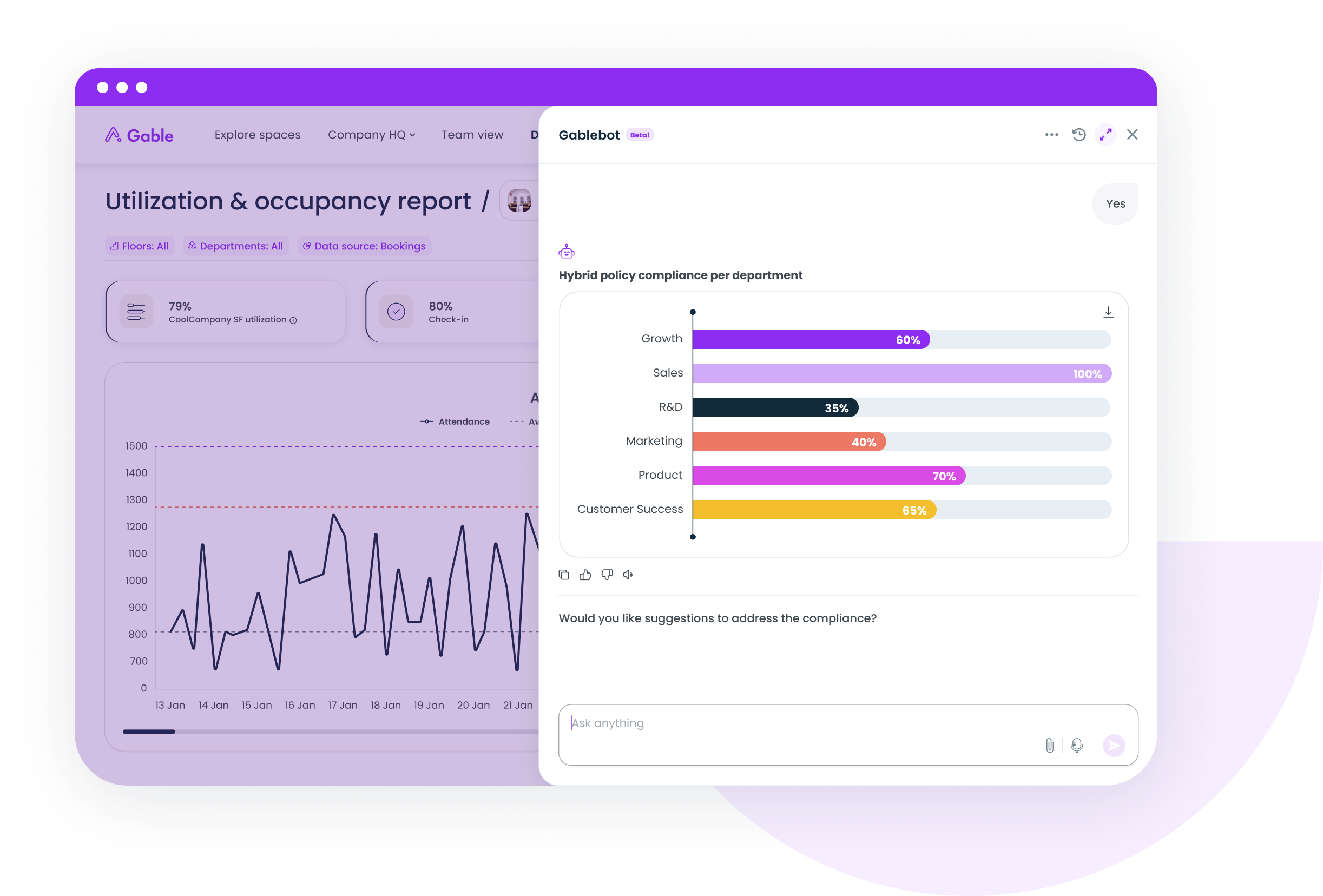
Gable Offices combines desk booking, room scheduling, and occupancy data into utilization insights your CFO will read.
Learn more
How to use utilization analysis to drive real estate decisions
Utilization analysis earns its keep when it feeds decisions with dollar signs attached.
- Lease renewals. Walk into a renewal 12 months early with three quarters of utilization data and you negotiate from evidence. A floor running at 35% with no growth plans is a sublease or givebacks conversation.
- Portfolio rightsizing. Compare cost per occupied seat across sites. Companies that act on this data see real returns; Gable customers have cut unused space by 32% using booking and occupancy insights to guide the decision.
- Flex versus fixed mix. When peaks are rare but real, on-demand workspace covers them more cheaply than leased space that sits empty the other 80% of the time. 55% of global occupiers already use flexible office solutions, per Cushman & Wakefield.
- Redesigns. Utilization by space type tells you what to build more of. If rooms run full while desks sit empty, the floor plan argument makes itself.
Pair each decision with a review date. Real estate moves slowly, but a policy change (new anchor days, check-in enforcement) shows up in utilization data within four to six weeks, which tells you quickly whether the fix worked. Ongoing measurement makes that feedback loop possible. The teams evaluating workplace analytics software for this usually want one thing above all: data that holds up in a lease negotiation.
Measure less, decide more
Utilization analysis works when it's small and consequential: two or three data sources you trust, a handful of thresholds agreed in advance, and a standing slot in the real estate calendar where the numbers turn into choices. Stanford research on hybrid work found hybrid schedules cut resignations by 33% with zero effect on productivity, so the flexible patterns creating all this measurement complexity are here to stay. The companies handling it best treat their workplace like a product, measured and resized as the data comes in.
See how Gable turns booking, badge, and sensor data into decisions you can defend in a lease negotiation.
Get a demo