.svg)


.svg)
- Offices ran at 53% utilization in 2025; the data shows exactly where.
- Measure three groups: office and attendance, tool usage, and employee experience.
- Gable unifies office and attendance data, with AI chat for instant answers.
- Turn numbers into decisions: cut space, tune hybrid policy, drop unused tools.
- Track patterns, not people; aggregate data answers every question that matters.
Digital workplace analytics is the data on how employees use their tools and offices: which desks get booked, which apps get opened, and how people feel about both. The case for measuring is straightforward. Global office utilization reached 53% in 2025, and that counts as progress, up from 38% the year before, according to CBRE. This guide covers what to measure, how to turn the numbers into decisions, and which types of tools do the work.
What is digital workplace analytics?
At its plainest: data on how employees use their tools and their offices. It combines three streams of workplace data (office and attendance, software usage, and employee experience) so you can see whether the workplace you're paying for matches the one people work in. It's a wider lens than workplace analytics, which centers on space and occupancy; the digital version adds the software stack and the experience layer on top.
Ownership usually sits with the workplace or people team, with IT feeding in tool usage data and HR feeding in survey results. One named owner who reports a single story to leadership beats three teams reporting three separate ones. The output feeds real estate planning, IT budgeting, and hybrid policy reviews, which is why agreeing on metric definitions matters before anyone builds a dashboard.
What to measure
You don't need dozens of metrics. Three groups cover most workplace decisions, and each answers a different question: where people work, what they work with, and how the whole setup feels to the people inside it. Start with the data you already generate (booking systems, badge logs, SSO, calendars) before buying anything new.
Office and attendance data
The physical layer: who shows up, when, and what they use once they're in.
- Occupancy: people present versus seats available, tracked through badge, WiFi, or check-in data; your office occupancy rate over time.
- Busiest days: which weekdays fill up, and how wide the gap is between peak and quiet days.
- Booking habits: desks and rooms reserved, checked into, or abandoned as no-shows.
- Utilization by space type: which floors, rooms, and neighborhoods earn their footprint, using space utilization metrics.
One note on sources: booking data shows intent, while badge and WiFi data show presence. The gap between the two, rooms reserved but sitting empty, is worth tracking on its own.
Tool usage data
The software layer: where digital work happens and where money leaks.
- Active tools: which apps employees open weekly, and which licenses sit idle.
- Frequency and depth: daily drivers versus tools opened once a quarter.
- Overlap: two or more tools doing the same job in different departments.
- Context-switching cost: how often people bounce between apps to finish one task.
That last one is larger than it looks. Workers toggle between apps and websites roughly 1,200 times a day and spend almost four hours a week reorienting after switching, about 9% of their time at work, according to Harvard Business Review.
Employee experience data
Usage numbers show what happened; experience data shows whether it worked for people. The stakes are real: only 20% of employees worldwide were engaged in 2025, a level Gallup estimates cost the global economy $10 trillion in lost productivity.
- Satisfaction scores: pulse survey or eNPS ratings on offices, tools, and the hybrid setup.
- Complaint themes: recurring tickets about booking, WiFi, access, or missing equipment.
- Post-change feedback: what employees say after a new tool, policy, or floor plan lands.
- Attendance sentiment: whether people who come in more often report a better or worse experience, which tests the policy's core assumption.
Together, these signals describe the digital workplace employee experience: whether the tools and spaces you provide help people do their work or get in the way of it.

Metrics matter when they remove friction. Our workplace efficiency guide covers how to measure performance and where teams lose the most time.
Read the guide
How to turn the data into decisions
Workplace data earns its keep when it changes something. Here's how the three data groups translate into three common calls.
Cut office space. The data shows two floors running well below the others month after month, while the office as a whole never approaches capacity. This gap is common: office utilization averages 54% globally against targets of 79%, per JLL. The move: consolidate teams onto fewer floors, then sublease or shed the extra space at renewal, using office space utilization data to size the smaller footprint with confidence rather than guesswork. If demand is spiky rather than low, flexible space for peak days beats carrying a fixed floor all year.
Adjust hybrid policy. The data shows attendance clustering midweek while Mondays and Fridays sit near empty, and some teams gathering on days the policy never anticipated. Two-thirds of US companies have settled into flexible work arrangements, according to MIT Sloan Management Review, so the question is how to structure flexibility, and the answer is in your attendance patterns. The move: set team anchor days that match observed gathering behavior, then compare your numbers against current hybrid work statistics to see how your policy stacks up. Share the data behind the change when you announce it; policies grounded in observed behavior get less pushback than ones announced without evidence.
Remove unused tools. The data shows a tool untouched by most of its seats for a full quarter, or two platforms doing the same job for different teams. That's budget hiding in plain sight, and it compounds with every renewal. The move: consolidate to one tool per job, cut idle seats before the contract renews, and show finance where the savings came from so the analytics program funds itself. Check the overlap finding with the teams involved first, since a tool that looks redundant sometimes covers an edge case the usage logs don't show.
Common mistakes to avoid
- Monitoring individuals instead of patterns: aggregate trends answer every space and tooling question; person-level tracking adds risk without adding insight.
- Collecting data nobody uses: every metric needs an owner and a decision it feeds, or it's noise.
- Ignoring what employees say: badge and usage data show what people do; surveys explain why they do it.
- Reading one snapshot as the truth: attendance and usage shift with seasons and policy changes, so trends beat point-in-time numbers.
Gable's AI copilot turns booking, badge, and attendance data into plain answers and exec-ready reports. No dashboard digging required.
Learn more
Tools that help
You don't need everything on day one. Match the tool type to the decisions in front of you. One buying criterion applies across all three: the tool should export or integrate its data, because the decisions above need office, usage, and survey numbers side by side.
Office data tools
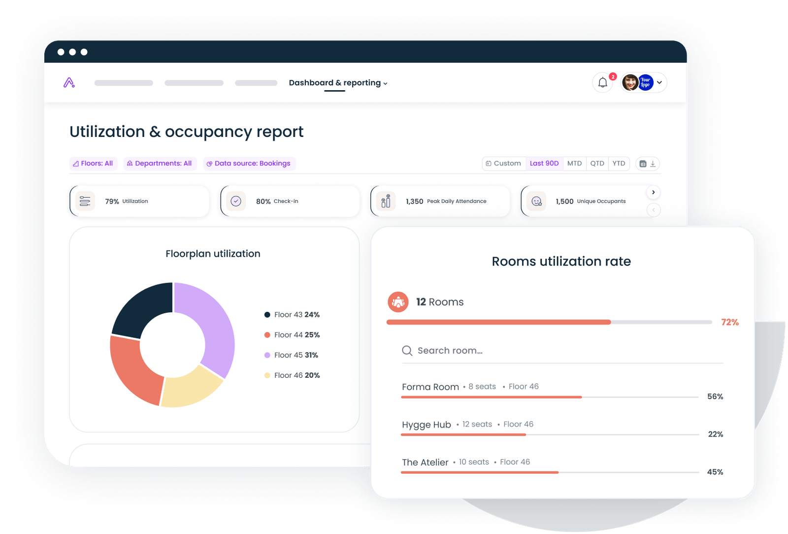
These platforms combine booking, badge, WiFi, and HR data into occupancy and attendance reporting. Gable's workplace analytics platform unifies those sources and adds AI chat, so you can ask which floors ran over capacity last month instead of digging for it; customers acting on this data have cut unused space by 32%.
Tool usage trackers
SaaS management platforms read SSO and login data to show which licenses get used, how often, and where tools overlap. They're the fastest route to the software savings described above, and most can flag idle seats automatically ahead of renewal dates.
Survey tools
Pulse survey platforms run short, regular check-ins on satisfaction and collect complaint themes in one place. Pick one that slices results by team and location, so the feedback maps directly onto your office and usage data instead of floating beside it.
Start with one decision
Analytics programs stall when they start with dashboards instead of decisions. Pick one call you need to make this quarter (a lease renewal, a policy change, a software contract) and collect the two or three metrics that inform it. Make the call, check the result, and repeat. The habit matters more than the size of the data stack, and it builds the credibility you'll need when the bigger real estate questions arrive.
See how Gable turns office, attendance, and booking data into decisions your leadership can act on.
Get a demo